Southwick Associates is a market research and economics firm, specializing in the hunting, shooting, sportfishing, and outdoor recreation markets. In 2016, the organization went through a rebrand where developed the logo package and art direction of the brand.
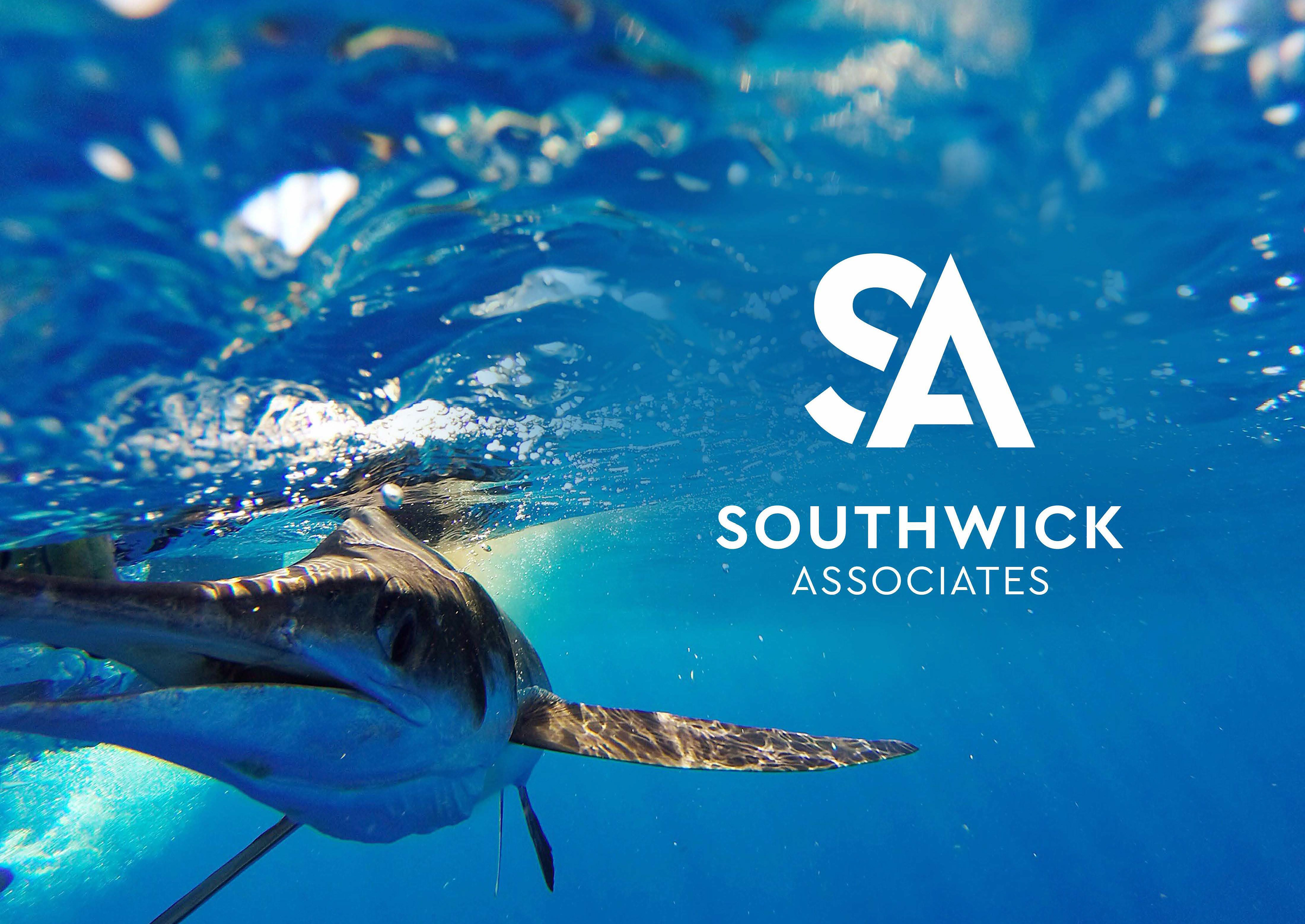
The Southwick Associates logo consists of two distinct elements, namely the icon and the word mark. The "S" in the icon represents the Southwick name, while the letter "A" represents our esteemed team of associates. Furthermore, our color scheme draws inspiration from our focus on outdoor research. The blue color of the letter "S" is a reference to the sky or sea, while the green color of the letter "A" symbolizes the challenge of ascending a mountain peak.